BART Station Renovation Plan Process Starts in Downtown Oakland
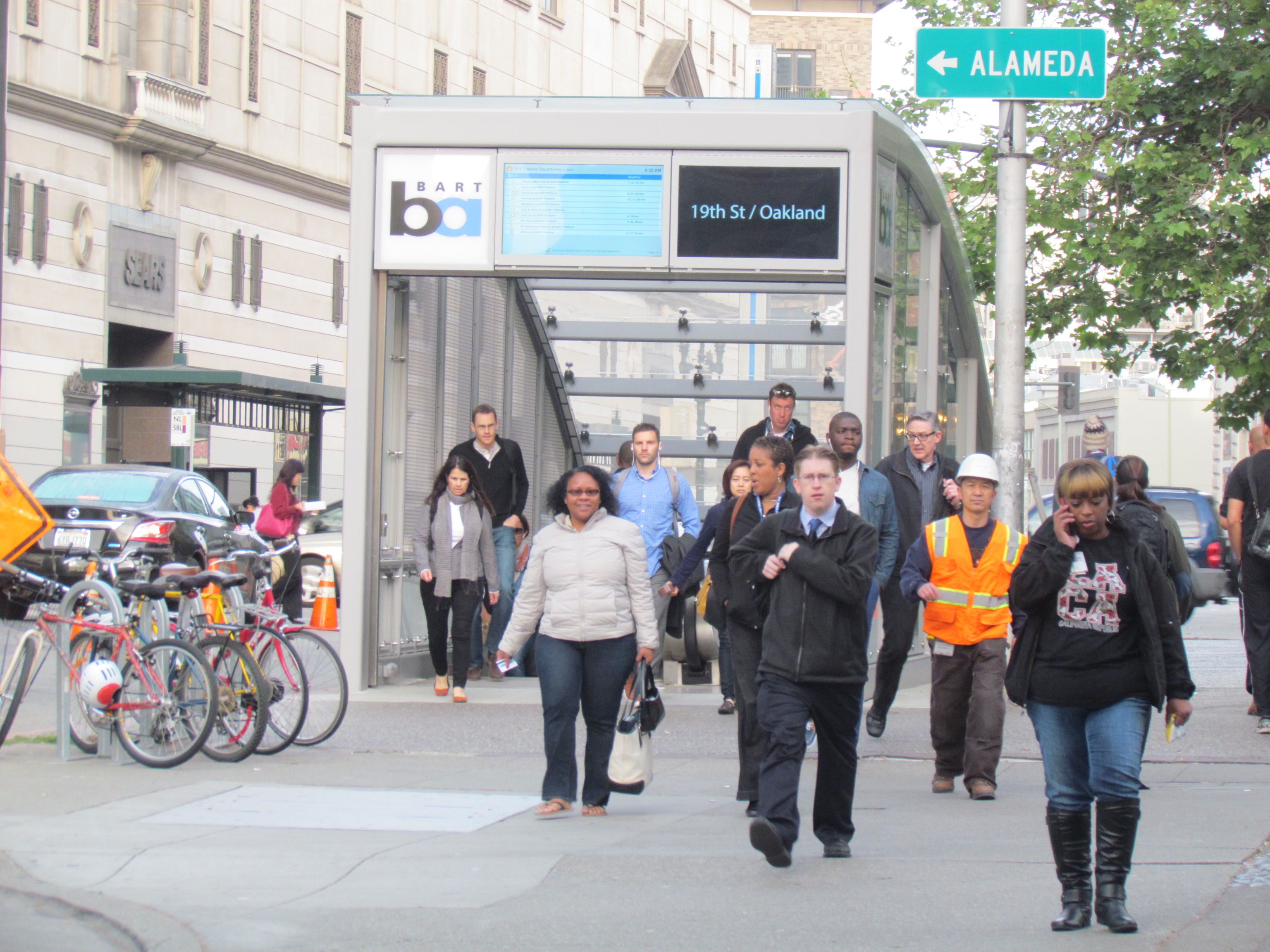
BART planners presented their ideas for renovating the 19th Street Station last week during two in-station events, seeking public comments on a plan to “improve the look, feel, and usability” of the station.
The way a station looks and feels is not a minor consideration. Stations that are inviting and easy to navigate can attract riders and also make them feel like they are cared for by the transit system. Stations that are easy to figure out give riders confidence about using transit, especially if they’re new to it.
For the most part BART stations fail in these areas. Many of its underground stations are cramped and dark. Signs directing people in and out of the stations are inadequate. To me, it feels like the whole system is embarrassed and doesn’t want to draw attention to itself.
The 19th Street station is a key transfer point for people traveling between San Francisco and the northern reaches of the Bay Area–and one of the most cramped stations in the entire system. The lower level platforms are half the width of most BART platforms. Entrances are via narrow stairways and escalators. There is an elevator—somewhere. Like most elevators on BART, it’s not easy to find.
BART planners have spent a lot of time rethinking their station areas, and the 19th Street Renovation Plan [PDF] currently being put out for public comment stems from an earlier Conceptual Design Plan [PDF]. The stated purpose of BART’s Station Modernization project is investment “to advance transit ridership and enhance the quality of life around the stations.”
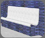
The renovation plan will help a bit with all those things. Lighting will be upgraded. New shaped coverings will make the existing seating areas look and feel more like benches than the low brick walls that they are. Sections of the existing walls around interior stairwells will be replaced with glass to bring in light and make them more inviting. Artists will create location-specific, permanent works for the station.
It will look better. It will feel more modern. Two new elevators will bring people from street level to the main concourse. Their locations are yet to be determined, but one of them may go into a new development in the old Sears building, which used to have an entrance right onto the BART concourse.
There is also some mention in the materials available on the website [PDF] of the need to widen existing entrances and add another one, but it’s not clear whether this is part of the current renovation plans or of some future discussion to be had later.
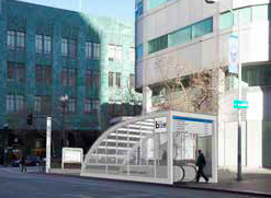
One of the entrances, at 20th Street, was recently covered with a glass awning. It is attractive, and it makes the BART entrance more visible and inviting than any other entrance on the entire system.
More of that, please.
There are two key issues that I would like BART station renovations to pay better attention to: bicycle access and wayfinding.
Bike parking is relatively new at 19th Street, and has been extremely popular since it was introduced five years ago. Double-decked bike racks in the center of the station still fill up during the day, even since the opening of the Uptown Bike Station at 19th and Broadway in February. The renovation should increase bike parking, but instead current plans show about the same number of spots. The renovation will move the existing high-capacity racks to a corner of the station, and, in their place, installing standard, single-tier circular racks.
BART officials have said they would rather people park their bikes than bring them onto crowded trains, but if so they need to increase parking opportunities. Why not add some simple, beautiful, and station-appropriate bike racks that increase the number of spaces? It doesn’t seem like relegating the existing racks to an out-of-the-way corner is the best way to make bicyclists feel that they’re welcome, nor that their bikes are safe.

Two staircases are slated to receive “bike channels” similar to ones in the 16th Street Station in San Francisco. These make it easier for people to roll their bikes up and down staircases (and presumably encourage bicyclists not to use escalators). BART is proud of the work it’s done to develop these bike channels. In California, they’re uncommon, perhaps innovative, but the channel tucked along the side of a narrow staircase is difficult for heavier bikes. I hope BART does more research to find international examples of well-made, easy-to-use channels before installing them.
The other area BART struggles with is signage.
In the past, BART’s wayfinding strategy seems to have consisted of putting up a few small signs and assuming people know their way around. A case in point: a map at the Ashby station of the surrounding neighborhood—not a very complete map, but the only one available—is posted on a wall that faces away from where people exit through the fare gates. Even if you somehow miraculously stumble upon it, it’s difficult to figure out which way it’s oriented. It’s pretty useless.
BART needs to do a much better job on wayfinding, and it’s hard to tell from the presentations exactly how wayfinding be handled in the renovations. Bigger directional signs and more and better maps would be a start. BART would do well to look at the work of Legible London, where planners worked to help Londoners learn to navigate their city by foot. They oriented maps to where people were standing, simplified signs, and made them consistent and easy to understand at a glance. That project is said to have profoundly changed the relationship of many Londoners to their city.
One thing the 19th Street Station does have going for it is its distinctive blue brick design, which distinguishes it from the red brick of the nearby, otherwise similar-looking 12th Street Station. That will not change. The colored brick may be outdated, but it is one of the more successful early BART station designs in that it makes it easy for passengers to recognize at a glance in which station they have arrived. However, riders new and old need more than color to help them figure out where they are and how to get where they’re going.
BART planners welcome your thoughts and comments on the renovation plan. I’m sending them this post; send them your ideas too.
Streetsblog has migrated to a new comment system. New commenters can register directly in the comments section of any article. Returning commenters: your previous comments and display name have been preserved, but you'll need to reclaim your account by clicking "Forgot your password?" on the sign-in form, entering your email, and following the verification link to set a new password — this is required because passwords could not be carried over during the migration. For questions, contact tips@streetsblog.org.

